|
|
Post by Donar on Nov 16, 2017 12:15:48 GMT -5
I think this topic deserves an own thread, so share interesting maps here! Fog frequency over Germany:  |
|
|
|
Post by alex992 on Nov 16, 2017 12:34:34 GMT -5
 Thunderstorm frequency map of the U.S. - stormiest parts are along the Gulf coast in LA, southern MS and southern AL, along with central and south FL. One interesting thing of note is that there's a very clear correlation with being directly north of the Gulf of Mexico and thunderstorm frequency. You can see it drops off when you're either east of the easternmost point of the Gulf and vice versa. I'm referring to areas not in FL btw, lol. |
|
|
|
Post by Donar on Nov 16, 2017 13:11:29 GMT -5
Interesting how few thunderstorms southern Texas gets.
|
|
|
|
Post by alex992 on Nov 16, 2017 13:15:56 GMT -5
I think it's due to them being on the western side of the Gulf as opposed to the east (storms tend to move west to east). Also more often than not, air flows are westerly which means a lot of their air flows come from the hot deserts in Mexico.
|
|
Deleted
Deleted Member
Posts: 0
|
Post by Deleted on Nov 16, 2017 13:19:52 GMT -5
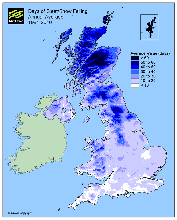
One good thing about the Met Office website is the maps. Here is annual snowfall, NI is the worst nation in the UK for snow, Boke.  |
|
|
|
Post by Cadeau on Nov 16, 2017 16:54:39 GMT -5
|
|
|
|
Post by Donar on Nov 17, 2017 11:06:14 GMT -5
All maps 1961-1990: Annual precipitation:  Number of lows < 0 °C (frost day):  Number of highs > 25 °C (summer day):  |
|
|
|
Post by boombo on Nov 17, 2017 12:01:44 GMT -5
|
|
|
|
Post by Ariete on Nov 17, 2017 12:05:46 GMT -5
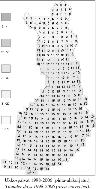
Days with thunder (funder):  |
|
|
|
Post by Babu on Nov 17, 2017 12:08:31 GMT -5
Really annoying to stop at 22'C and 1600h... |
|
|
|
Post by boombo on Nov 17, 2017 12:15:45 GMT -5
Really annoying to stop at 22'C and 1600h... You can get more detail if you choose the region you want, which in your case is southern England. Unfortunately that's only available for 1971-2000 though so doesn't exactly match the national maps I posted:   And btw, if you (and this also applies to everybody else) want to quote somebody's post which has loads of pictures in it, can you make sure to take the pictures themselves out of the quote? I fixed your post so the maps don't all show up on the page twice  |
|
|
|
Post by ral31 on Dec 27, 2017 16:35:46 GMT -5
|
|
|
|
Post by Cadeau on Dec 27, 2017 17:24:49 GMT -5
January average mean temperature of Japanese Archipelago & Korean Peninsula
|
|
|
|
Post by Giorbanguly on Dec 28, 2017 13:20:12 GMT -5
January average mean temperature of Japanese Archipelago & Korean Peninsula Why is Busan so mild? Also kinda bizarre that West Coast of Japan is warmer than the East Coast, even tho East Coast doesn't get sea effect snow |
|
Deleted
Deleted Member
Posts: 0
|
Post by Deleted on Dec 28, 2017 13:44:20 GMT -5
average annual temperature in belgium  average january temps  averages in july  |
|
|
|
Post by Cadeau on Dec 28, 2017 14:18:22 GMT -5
Why is Busan so mild? Also kinda bizarre that West Coast of Japan is warmer than the East Coast, even tho East Coast doesn't get sea effect snow It's not any milder than coastal Japanese city at the similar latitude(Tokyo, Nagoya, Osaka). Even nearby in Tsushima across the strait sees drastically warmer than Busan. Also remind that you have to tilt 30° toward the right to see parallels to the latitude in this map. |
|
Deleted
Deleted Member
Posts: 0
|
Post by Deleted on Jan 18, 2018 11:37:20 GMT -5
found these cool maps on SMHI:s homepage, and they're not outdated   average date for last frost 1991-2017  average date for first frost 1991-2016  the average highest daily mean in a year 1991-2013  the average lowest daily mean in a year 1991-2013 |
|
|
|
Post by nei on Jan 19, 2018 23:36:10 GMT -5
Diurnal range maps of US. Big diurnal range areas in summer are all in the west; California, Oregon and Nevada look like they have the most. Interesting in winter, diurnal range goes down going north along the east coast and then up again [dryness more of an effect than lower sun angle?]
|
|
|
|
Post by Babu on Jan 24, 2018 5:44:24 GMT -5
Here's an isotherm for the Arctic.  |
|
|
|
Post by Nidaros on Jan 24, 2018 6:03:25 GMT -5
That map seems not too bad for the 10C - isoterm, although sheltered locations in northern Iceland also goes above 10C in warmest month.
However, for the green line marking the treeline it is rather ridiculous for Norway at least. Large forests north of that green line, both conifer and decidous. Seems the green line has been drawn in Norway where the natural spruce forest had its migration halted by the Saltfjell mountains. But what about the pine, birch, aspen etc dominated forest further north?
|
|