|
|
Post by Beercules on Nov 10, 2020 8:12:15 GMT -5
I saw that once before. Written by a 5 year old with down syndrome. |
|
|
|
Post by Ethereal on Nov 10, 2020 8:18:18 GMT -5
^Try reading AussieSpecialist's hogwash: "Sydney enjoys a sunny, Mediterranean-style climate all year round with more than 340 sunny days per year."
If you ask Google how many sunny days Sydney has per year, the above sentence will come up. Lol.
|
|
|
|
Post by Donar on Nov 17, 2020 8:49:03 GMT -5
I've got monthly climate data for Wichita, Kansas. Apparently it recorded a 40.5 °C (105 F) average high in July 1980  |
|
|
|
Post by Benfxmth on Nov 17, 2020 9:00:19 GMT -5
I've got monthly climate data for Wichita, Kansas. Apparently it recorded a 40.5 °C (105 F) average high in July 1980  Daily data there:  Only 2 highs below 95°F that month, and it's the hottest month on record by 1.1°F in means there. Salina averaged at 102.8°F for highs, the third hottest to 1934 and 1936. |
|
Deleted
Deleted Member
Posts: 0
|
Post by Deleted on Nov 17, 2020 11:12:14 GMT -5
I've got monthly climate data for Wichita, Kansas. Apparently it recorded a 40.5 °C (105 F) average high in July 1980  Daily data there: -image snipped- Only 2 highs below 95°F that month, and it's the hottest month on record by 1.1°F in means there. Salina averaged at 102.8°F for highs, the third hottest to 1934 and 1936. Holy Shit!  Nuts how hot it was there, especially considering the summer of 1980 up here was nothing to write home about. |
|
|
|
Post by jgtheone on Nov 18, 2020 4:45:14 GMT -5
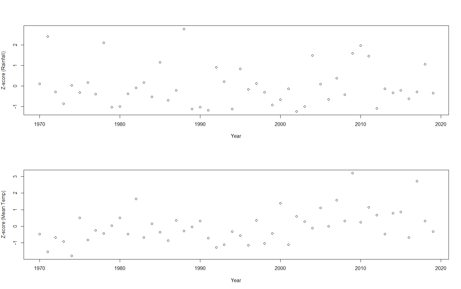
Moron Here is a side by side representation of the z-score of each November's mean temp and rainfall by year, using the Melbourne Airport data. It's not the best visualisation (I'm still a newbie to R), but I can't see too much of a trend here. I couldn't find how to combine the two graphs on the same set of axes either lol if anyone knows that would be great. 
|
|
|
|
Post by Donar on Nov 18, 2020 5:58:02 GMT -5
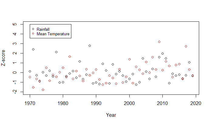
Moron Here is a side by side representation of the z-score of each November's mean temp and rainfall by year, using the Melbourne Airport data. It's not the best visualisation (I'm still a newbie to R), but I can't see too much of a trend here. I couldn't find how to combine the two graphs on the same set of axes either lol if anyone knows that would be great. Nice, another R user on here!
plot(data$Precip ~ data$Year, ylim = c(-2,4))
points(x = data$Year, y=data$Temp, col= "red")
I think something like this should work, another nice package for plotting in R is ggplot2...
|
|
|
|
Post by jgtheone on Nov 18, 2020 6:44:12 GMT -5
Moron Here is a side by side representation of the z-score of each November's mean temp and rainfall by year, using the Melbourne Airport data. It's not the best visualisation (I'm still a newbie to R), but I can't see too much of a trend here. I couldn't find how to combine the two graphs on the same set of axes either lol if anyone knows that would be great. Nice, another R user on here!
plot(data$Precip ~ data$Year, ylim = c(-2,4))
points(x = data$Year, y=data$Temp, col= "red")
I think something like this should work, another nice package for plotting in R is ggplot2...
Thanks, this works a bit better. I know of ggplot2, I used it a bit at the start of this year but haven't touched it since. Will need to practice using it again lol  |
|
|
|
Post by Moron on Nov 18, 2020 9:23:39 GMT -5
Maybe there's a loose correlation, there's seem to be an agreed trend between 2000-2010 (dry and cool slowly becoming warm and wet) and then an abrupt cool and dry in the mid-late 2010s. Maybe that's my eyes trying to see an agreed trend (like confirmation bias) but there seems to be something there.
|
|
|
|
Post by Donar on Nov 18, 2020 10:36:41 GMT -5
Nice, another R user on here!
plot(data$Precip ~ data$Year, ylim = c(-2,4))
points(x = data$Year, y=data$Temp, col= "red")
I think something like this should work, another nice package for plotting in R is ggplot2...
Thanks, this works a bit better. I know of ggplot2, I used it a bit at the start of this year but haven't touched it since. Will need to practice using it again lol Yeah still doesn't look great.. maybe lines connecting the points could visualise the data better.. the code would look like this:
plot(data$Precip ~ data$YEAR, ylim = c(-2,5), col= "blue", pch=16) lines(x = data$YEAR, y = data$Precip, col= "blue")
points(data$Temp ~ data$YEAR, col = "red", pch=16)
lines(x = data$YEAR, y = data$Temp, col= "red") abline(h=0)
But I think to see a correlation between temperature and rainfall deviations it would be more helpful to plot them against each other and not by year:
plot(data$Precip ~ data$Temp) abline(lm(data$Precip ~ data$Temp))
|
|
|
|
Post by boombo on Nov 24, 2020 13:49:22 GMT -5
The climate of Oymyakon is really weird and I don't just mean how cold it is. I know it's in a valley and inversion layers have odd temperature dynamics going on but I've never seen anything like this before, look at this table of daily record highs for December:  How is it possible for somewhere with data going back to 1943 to have a record high for 6th December of -6C when there are days even in November with record highs in the -20s, can Oymyakon get a really rare massive foehn effect or something? The record high also falls by 17C from one day to the next between the 17th and 18th. The difference between the 11th and the two days either side of it is also pretty huge considering those records were all set in the same week. The record lows on the other hand are extremely regular, they basically track the average low throughout the month minus about 12 or 15C:  |
|
|
|
Post by Ethereal on Nov 26, 2020 4:53:01 GMT -5
|
|
|
|
Post by Beercules on Nov 26, 2020 9:12:06 GMT -5
That truncated excuse of an article makes no mention of exactly what those "heat loggers" were, nor where/how they were situated. It also fails to mention that the Penroid station is an official, regulation station using international-standard equipment. "Research commissioned by Penrith Council"..... that right there is a red flag already... That video at the start of the that "article" was nothing more than a horrid, biased piece of scare-mongering shit. Says it all really. An abhorrent example of garbage "journalism", which the gullible will unfortunately be exposed to without knowing the facts, especially that despicable video. Amazing that this is coming from news.com.au, I would've expected such tripe from the Guardian, the ABC, or The Age. Deplorable really. 100% deadset that those "heat loggers" were nothing more than plastic thermometers from the hardware store held up in the sun by a couple of recently-graduated 22 year old desk chick admin assistants, just like during the Spanish Heatwave in 2018, which proudly declared headlines of "50C".... www.mirror.co.uk/news/uk-news/temperature-soars-50c-spain-portugal-13029601All those responsible for this garbage need to be strung up upside down and scourged with a leather belt. |
|
|
|
Post by knot on Nov 26, 2020 15:45:19 GMT -5
LOL, it really is astounding that those "heat loggers" are deemed to be perfectly accurate…yet somehow, the official Stevenson Screen stations of the 19th Century are brushed away as being "unreliable". If it supports the Gorebull Warming agenda—it's accurate!  |
|
|
|
Post by Ariete on Nov 26, 2020 15:56:20 GMT -5
the official Stevenson Screen stations
I see what you did there.
|
|
|
|
Post by knot on Nov 26, 2020 16:00:09 GMT -5
I see what you did there.
Do elaborate… |
|
|
|
Post by Ariete on Nov 26, 2020 16:02:57 GMT -5
Mentioning the Stevenson screen. What I teased you about last week.
Not that I believe those temps recorded for that matter.
|
|
|
|
Post by Ethereal on Nov 27, 2020 1:16:00 GMT -5
That truncated excuse of an article makes no mention of exactly what those "heat loggers" were, nor where/how they were situated. It also fails to mention that the Penroid station is an official, regulation station using international-standard equipment. "Research commissioned by Penrith Council"..... that right there is a red flag already... That video at the start of the that "article" was nothing more than a horrid, biased piece of scare-mongering shit. Says it all really. An abhorrent example of garbage "journalism", which the gullible will unfortunately be exposed to without knowing the facts, especially that despicable video. Amazing that this is coming from news.com.au, I would've expected such tripe from the Guardian, the ABC, or The Age. Deplorable really. 100% deadset that those "heat loggers" were nothing more than plastic thermometers from the hardware store held up in the sun by a couple of recently-graduated 22 year old desk chick admin assistants, just like during the Spanish Heatwave in 2018, which proudly declared headlines of "50C".... www.mirror.co.uk/news/uk-news/temperature-soars-50c-spain-portugal-13029601All those responsible for this garbage need to be strung up upside down and scourged with a leather belt. I understand that there is fearmongering in this and all (a la, climate change scare tactics, which I myself cringe at tbh), but don't you think 50C may have been reached in the more closed areas, less vegetated areas, such as in suburban streets or main streets in around Penrith? Weather stations are usually in open areas, far from buildings and paved roads. So it's natural that weather readings would be 'cooler' in open areas. So would a 50C+ reading in the shade in some street near Penrith really be implausible? |
|
|
|
Post by Beercules on Nov 27, 2020 1:29:31 GMT -5
I would be skeptical. When you consider historically how difficult it is to get from 49C to 50C out in the usual hotspots of SA and WA for example, as we have seen many times in the recent past, that last 1 degree seems to be exponentially hard to attain. There's dozens of 49C+ highs, but you can count the official 50's on one hand. Look at Port Augusta in Jan 2019, by all accounts that was a perfect air mass as any, but it still fell short at 49.5C.
Suburban streets and any concrete within immediate proximity will modify readings so would not qualify. A screen placed on asphalt amongst buildings is not valid. A park in a suburban area would cut the mustard, but anything directly above a road or building roof, or close to a wall(s), no.
|
|
|
|
Post by jgtheone on Nov 28, 2020 0:04:16 GMT -5
Mediterranean paradise in Japan???!?!?!  |
|